Kolo
My Role: Art Direction and Graphic Designer
Kolo is a personal collaboration of mine with an upcoming cafe located in my hometown, Lviv, Ukraine. The client approached me with a request to design a modern brand identity that captures the essence of Ukrainian folklore. The concept behind "Kolo" revolves around inclusivity and friendliness, symbolizing the idea of visitors feeling at home, as if they were surrounded by their own circle of family and friends.
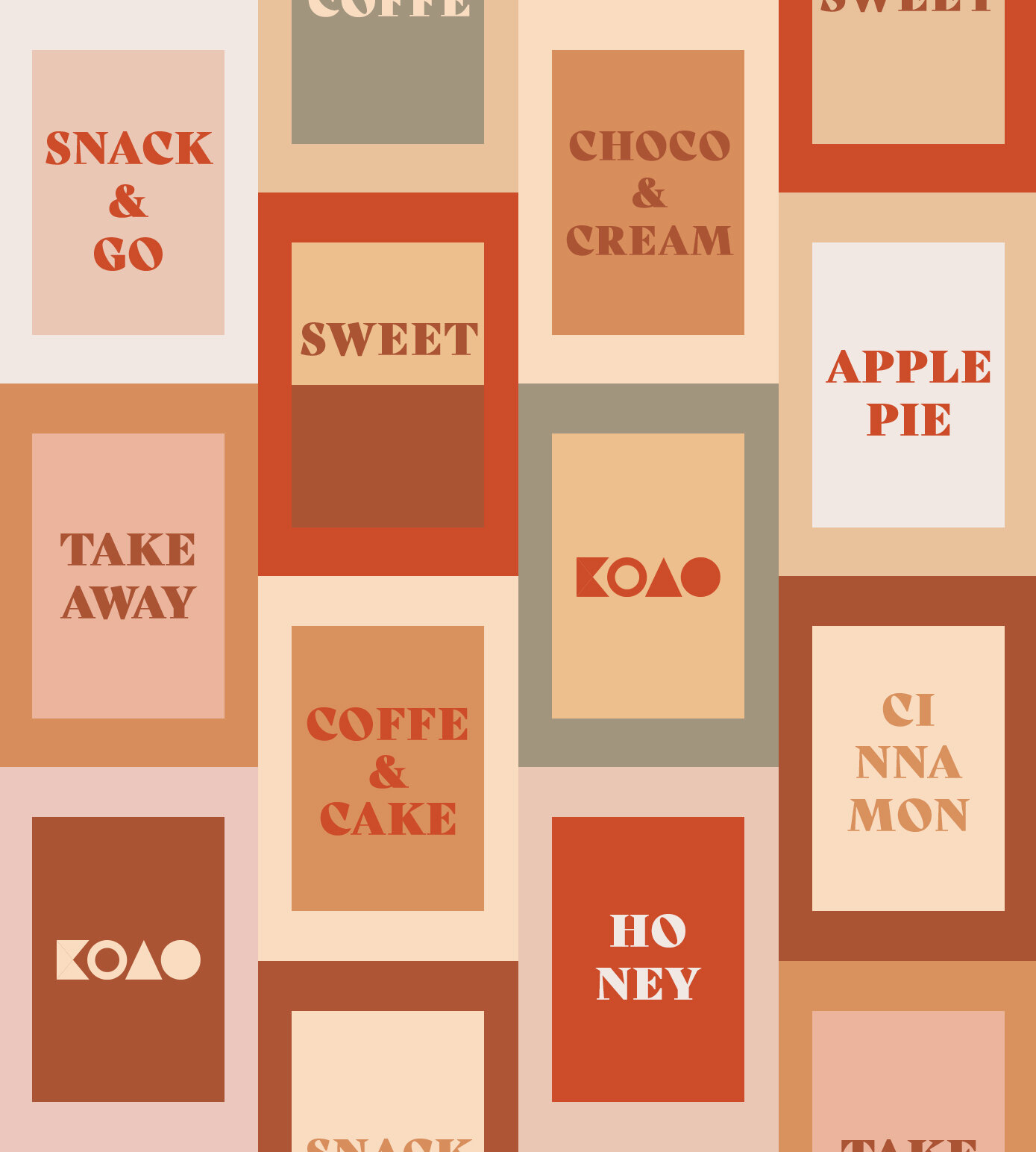
I crafted the visual identity, that encapsulates Kolo’s values and spirit. The logo features a stylized representation of a circle, symbolizing unity, harmony, and the unbreakable bonds of friendship. Bold and clean typography adds a modern touch, while subtle nods to Ukrainian folklore, such as intricate patterns or symbolic motifs, are seamlessly incorporated into the overall design.

While developing landing page, I used two main pillars of the brand’s identity: simplicity and eye-catching design.


While creating logotype for Kolo, I have had two main elements to keep in mind:
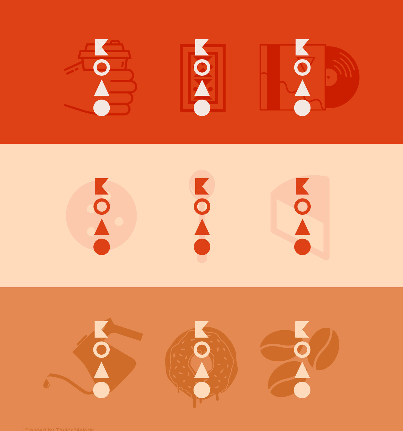
Geometry. Geometry has always been popular among Ukrainians, and this is evident in the decorative patterns used in their houses, dishes, and clothing items. Since the brand’s name is a geometric shape (a circle), I wanted to incorporate that element into the logo. Therefore, each of the four letters in the logo is constructed using simple geometric shapes.
Color. Color is another crucial visual aspect of our brand. In Ukrainian culture, color holds significant importance and can be observed in various aspects, ranging from interior designs to fashion. As Kolo specializes in desserts, I have carefully selected a color scheme that reflects the most common ingredients used in our desserts, such as chocolate, almonds, and strawberries. These vibrant colors add to the overall visual appeal of our brand.